Monday, September 17, 2012

Yoforia

The Space:
Yoforia (Downtown Athens)


The Client:

All ages and genders
- Health conscious, environmentally friendly, and organic
- Eat yogurt and socialize with family and friends
- To bring an “instant smile to every costumer, partner, and employee.”

The Floor Plan:


The Concept:
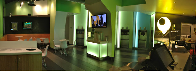
The concept of the Yoforia is organic/natural with many aesthetic elements.  The organic design is seen in the bamboo seating, the green colors of the walls, and the astroturf on the walls.
Analyze:
My first impressions of the space was that is was over crowded, the center column was in the way, and the flow of the room was very ambiguous.  I liked the space because all the design elements connected well, the space had a clean and sanitary look about it that is important in a food establishment, and it functioned as a yogurt shop.  I did not like the space initially because the lighting was awful.  It was extremely dark and the lighting panels around the yogurt machines were flickering and hurt my eyes.  Overall, I was not pleased with the space when I walked in and would rather visit the other locations.

1.  The intended purpose of this space is for people of all ages to eat yogurt and socialize.
2.  The room is functional for the size, purpose, and intended user.  The size is small but it does function as a yogurt shop.  The purpose is fulfilled because the space has yogurt machines, a cash register, and seating area.  This means the space is functional for its purpose.  The space is successful in drawing in the intended user.  While I was sitting in the shop every type of person and age group came in to get yogurt.
3.  The principles and elements of design exist in the the space and are used to emphasize the designLine is used in several places in the space.  The first and most obvious place it is used is in the lighted panels behind the yogurt machines.  The panels have lines that bring your eye up and see the hight of the room.  Line is also used in the bamboo wood on the benches.  The benches are a line and the grain is a use of line.  The tables in the space a point and the chairs that go around them are repetition and rhythm.  

4. The aesthetics of the yogurt shop are pleasing to the eye.  There is a multitude of textures, shapes, and size.  The most unique texture in the space is the astroturf wall.  The space also has a lighted wall behind the yogurt machines.  This looks amazing but it also was hard on the eyes.  The lights flickered because they were incandescent bulbs.  The light panels could have used different types of lights to help reduce the eye stress.  The room also had over head track lighting and could have had more lights to brighten the room.  The benches that were made out of bamboo were natural colored and pleasing to the eye.  They were a good hight and sat well.  The tables were round and mimicked the “o” in Yoforia.  There space also had tile floors that contrasted well to the natural colors.  There was a large amount of glass in the space that added to the clean look.  All of the elements fit well together while giving the eye visual interest.

5. The room size should be larger than it is now.  The room shape could be the same it just needs to be proportionally larger.  The shape now is a rectangle meaning it is wider than longer.  This shape functioned well because it allowed the area to have enough yogurt machines along the back wall but it needed to be deeper to have a bigger seating area.

6. The space needs light, chairs, tables, and trash cans.  This interior does not need a large amount of furnishings because the space is not intended to hold people for an extended amount of time.  The most important furnishing the space need is light to see, and chairs and tables.  The amount of each of these is extremely important.  It needs enough to seat people with out crowding the space. It needs a cash register near the exit so people can get their yogurt and then pay for it before they leave.

7. The furnishings and accessories should be arranged very similar to the way they already are but with a few modifications.  The lighting needs to be brighter or add more overhead lighting.  The tables and chairs should be moved further apart to accommodate people getting in and out of the tables.  This will allow fluid access to the yogurt.  The one table that is in the way of the circulation path should also be moved in and away from the center post.  The tables are already grounded and zoned around the benches.  

8. People should enter the room through the door, pick up a bowl in the center, walk around the column to the yogurt, and then beside the counter down to the cash register to pay.

9. The room connects to other interior spaces well.  The bathroom is down the hall and and has a door.  It connects but is not in an obvious place.  The only other connection to another space is the swinging door behind the counter into the kitchen area.  This should be a private area and only accessible by employes.  Since the door is behind the counter this is achieved.

10. The room should connect to the exterior.  It needs to connect to the exterior so that customers can come in and out of the shop.  It also needs to have windows to connect the store to the exterior so that people walking by can see in and be drawn into the shop.  The windows that connect to the exterior also allows natural light to be brought into the space.  

11. The space is multilayered and rich.  It would be hard to add to this space.  The space is multilayered because of the column in the middle and rich due to the many shapes and textures in the space.  If the space was changed to be longer it would make it be easier to be multilayered.  

Conclusions:
My first impressions of the space was it was not successful and my final analysis reviled that the space is not successful.  The space functions as a yogurt shop, but it is not successfully functional.  The flow is very broken, there is not central focal point, and there is not enough seating for the amount of people who want to sit down.

Monday, September 10, 2012

Principles

Symmetrical
Both of these couches are symmetrical.  The top couch has side tables with lamps that adds symmetry and the bottom couch just uses the pillows to show the symmetry.

All of these images are symmetrical.  The top left image is a duplex that is perfectly symmetrical even on the inside. The middle picture is the entrance to the Lamar Lewis store downtown and is symmetrical due to the window cases on each side.  The bottom left picture is of a cooktop and is also symmetrical.  The right picture is of Notre Dame in Paris and the outside of this building is perfectly symmetrical.

Asymmetrical 
 The above three images use picture frames of items on a shelf to show asymmetrical balance.  The pictures and objects are not the same but they are placed in a way that balance each other.

The top image uses asymmetrical balance in the tall structures on the right side of the building and windows on the bottom left to balance each other out.  Similarly, the bottom right picture uses windows at the top of the image that are balanced by the book shelf at the bottom.  The left image uses asymmetrical balance in the objects to the top of the table.  They are not the same objects but use similar weight to balance each other out.

Radial
All six of these images are radial symmetry.  The top left picture is of fan blades that radiate out from the motor.  The middle left picture is of an umbrella and its supports radiating out.  The bottom left picture is of a chandler and the lights coming from the center.  The top middle picture uses radial symmetry in the legs of the table.  The bottom middle image has seats that radiate out from the fire pit.  The right picture is of a coat rack that has hooks and legs that use the center post as the point of radial symmetry. 
Emphasis
The top left picture has emphasis on the horse head over the door and the bottom left has emphasis on the G door handle.  The first thing that catches the eye in the top right picture is the dog and the red wall catches your eye first in the bottom right picture and each of these elements have the emphasis.
Shape and color are the emphasis of each of these pictures.  The left picture uses emphasis is the square rug and the right picture shows emphasis in the red color.

Repetition and Rhythm
Repetition and rhythm are show by these pictures in there use of shapes.  The top picture has repetition in the tiles and the patter the tiles makes.  The chair has repetition and rhythm in the circles in the back of the chair.  The bottom right picture uses the chalk board circles to show repetition and rhythm.
These three photos also show repetition and rhythm.  The light show repetition in the light it puts out, the chairs show repetition in the amount of them and the coliseums arches show repetition and rhythm.

Movement
The left picture of the hall way shows movement because it carries your eye down the hall to see what might be at the end.  The top right picture has movement because of the girl walking and the light coming from the door.  It makes your eye move there and wonder what is beyond the door.  The bottom right picture has movement because the contrast in colors causes your eve to move from the white cabinets, to the counter top, to the lights.
These three images have movement because they pull your eye down the photo.  The top photo of Transmetropolitan has movement in the tile walk way, the bottom photo has movement in the carpet, and the diagonal lines of the stairwell has movement.

Proportion and Scale
These images show proportion and in different ways.  The 2 on the wall is proportional to the spot but the proportion also notes the importance that it is the second level.  The A is un-proportional the the rest of the items on the shelf and shows that the A should stand out.
These three images also show proportion and scale.  The clock has marks on the face that are proportional to the clock and at scale to each other.  The faucet has handles that are at scale to the spout.  The bar stools are proportional the the height of the bar because if they were not they would be useless.

Unity and Harmony
The top picture has unity and harmony because it is the inside of Peppers Deli and it represents the theme with out having identical images.  The bottom left picture has unity and harmony because it is a lodge themed bar that has wood and stone that complement each other.  The bottom right picture has unity and harmony in the repetition of the windows on each side.
Each of these pictures have unity and harmony because the architectural/aesthetic features repute themselves. 

Variety
Each of these pictures have variety because they all have multiple building materials in each picture.  Top: Marble, metal, and wood. Left: Siding, brick, and shingles. Right: Cinder blocks, rod iron, sheet metal, and wood.
Each of these pictures have variety because they all have multiple building materials in each picture.  Left: Chalk board, corrugated metal ceiling tiles, and wood bead board. Top Right: Wall paper, chandler, and exposed metal beams.  Bottom Right: Brick, windows, cement, corrugated metal, and wood.
Asymmetrical

Wednesday, September 5, 2012

Texture and Space

Texture
Actual
These four images are examples of actual texture.  The top left picture is of a pineapple and they have a very sharp texture.  The top right picture is of blades of grass.  The bottom left picture is of bricks on a sidewalk ramp. The bumps are the texture to prevent people from slipping.  The bottom right picture is of an electric stove coil.  The coil itself has texture and the red parts show the texture of heat. 

Implied
The top right and bottom left pictures are of laminate flooring.  One imitates wood and the other a tile/stone but neither have any texture.  The top right corner is of a stainless steal light base.  It looks like it has a brushed texture but it is actually polished smooth.  The bottom left picture is of a granite and looks rough but is also polished smooth. 

Space
Actual
These two rooms are actual spaces because they are designed for one specific use.   The rooms would not functional in other capacities.   The left is a laundry room and it is obvious on the washer and dryer in the room.  The left is a lecture hall in the SLC and is an actual space because the chairs are in permeant places and direction.  

Implied
These four photos are implied spaces.  The top left is of cars in Tate set up for students to study.  The room is an open space and could be arranged in many ways and this arrangement implies it is a study space.  The top right is a covered hallway in an orphanage in Oaxaca, Mexico.  It is an implied space because it has an open side could be used in many different ways.  The bottom left is a cross walk and is an implied space because it suggests where people should walk but does not say you can not walk in the street.  The bottom right picture is of a parking space in a parking garage on campus.  I think this is an implied space because social rules say that the car should be parked inside the lines but people all the time take up two spots because they park over the line.  This shows it implies you should park between but is not an actual wall that prevents people from parking over the line.   

Sunday, September 2, 2012

Week Three Posts

For my week three posts, I picked websites that would be used by a designer when designing a room.  I picked websites that deal with windows, doors, paint, appliances, textiles, lighting, decorative pieces, and furniture.  I picked links based on companies that I have heard of or even used there products.  My favorite links are Pella, GE Appliances, Viking, and Create and Barrel.

Plane and Form

Plane
Each of these pictures have several planes in each picture.  The plane in the top left are the glass windows on the front of the bakery.  The plane in the next picture down is the stop sign.  The white boarder edges the plane and the red is the plane.  The next picture down contains a plane in the infield grass diamond.  The dirt frames and creates the plane.  The last picture of the air traffic control tower has many planes.  Each side of the tower is a plane and the glass windows are a plane.
Form
Geometric
I decided to focus on a sphere for the geometric form.  The lights in three of the pictures are spheres and the softball in the last picture is also a sphere.


Natural
All four of these pictures represent natural form.  The top two are nature and are the natural form because they were found in nature. The bottom two statues are natural form because they mimic the natural form of a human and a dog.

Abstract
These images all show abstract form because they all show qualities of the actual form but have been altered.  The top left example is of a piggy bank and the top right picture is of a bulldog bottle opener.  Both of these pictures mimic the form of the actual animal but neither one shows what the real animal would do.  The bottom right picture is from Dawson Hall and shows the form of a woman but altered to be because they do not have arms.  The bottom left pictures, in my opinion is a mushroom, that is used as a driveway marker.  I included it in the abstract form area because I think I know what it represents and I would assume the artist did too so it is abstract, but some people might say it is non-objective.  This picture shows how the line between abstract and non-objective can be blurry.

Non-Objective


These two pictures show non-objective forms because they are not obvious that they model any particular shape.  The top picture is of the USS Arizona memorial in Hawaii and shows no particular recognizable form.  The bottom picture is of a light in my room and also is non-objective form because it does not mimic any particular form.

Static
These two pictures are examples of static because they both are permeant and powerful.  The bulldog is static because it is cement and in a powerful guarding stance.  The next pictures from ruins in Rome outside the coliseum.  These doors and columns have been there for thousands of hers and are not going anywhere.
Dynamic
These two images are examples of dynamic form because you can see movement in the pictures.  The flag is dynamic because you can see the ripples from the wind.  The flame at JFK's grave is dynamic because you can see the movement in the billowing of the flame.

Wednesday, August 29, 2012

Point, Line, and Shape

Point

The yoforia sign at five points shows point in the "O" of the name.  The point focuses the reader in the design to the "O" and makes the simple word unforgettable by the use of point.


This collage shows shows point in both images.  The water droplets on the left side are the point in the photo and the small holes in the lane ropes on the right are point.  These both extenuate the details of the photo and draw attention to these two areas of the photo.


The two rows of buttons with letters and numbers and the return coin button are examples of point.  The rings that hold the snacks mimic the buttons and are also point.  Point is used in this photo in repetition and shows the monatony of the vending machine.


The rocks in both of these photos show point.  The rocks themselves are point in there circular shape and the dimples in the rocks also are point.  The point draws your eyes in and and around the entire area of the photo.   

Horizontal

These two pictures have horizontal lines in the bricks.  The picture on the left of a church in Jamaica has horizontal lines in the bricks.  The picture on the right is of the front of the Air and Space Museum in D.C. and has horizontal lines in the marble wall and also has a horizontal line where the marble wall meets the marble floor.  The bricks bring stability to both of these structures.


There are several horizontal lines in this picture taken at the top of Stone Mountian.  There is the line of the fence, the line where the rock meets the tree line, and the horizon line.  All of these lines bring a sense of calm to this picture.


There are two sets of horizontal lines in this picture depending on the perspective that you look at it.  The metal rails are one set of horizontal lines and the wooden logs are also horizontal lines.  The metal rails move the eye down the picture and the wooden logs use repetition which adds a sense of calm.

Vertical

The arch has three very perdominate vertical lines.  The columns are vertical lines that draw the eye up to the ornate details in the actual arch its self.


There are many vertical lines on the pillars at the Lincoln Memorial in D.C.  The columns are vertical lines and the groves on the columns also form vertical lines.  These columns are massive and draw the eye up and down to see the extreme height of the building.


The vertical lines on this outside of this dorm are used in several ways.  The lines denote the height of the building but also show the number of floors in the dorm.


Vertical lines are used in this massive piece of art in Indianapolis, Indiana.  The edges of the small squares, the edges of the rectangles that hold the small squares, and the posts that go all the way to the top are all vertical lines.  The lines draw the eye up and down the piece.

Diagonal

This window in Jamaica has diagonal lines in the top of the stained glass.  This brings energy to the top where the light will come through. 


There are many diagonal lines in this picture of the Chapel bell.   The cross sections have diagonal lines and create movement up the bell tower.


The front of the Chapel on north campus has diagonal lines coming down from the peak of the roof.  It creates a feeling of energy from such a ornate and large building.


This church in Jamaica has two sets of diagonal lines that come down from the peaks of the roof and patio.  They create a more casual feel because the building is a simple structure.

Organic

The railroad traces have an organic line in them as they bend in the turn.  This gives a sense of motion to the picture even though there is no train in the image.


The top of the arch had several organic lines.  The most predominate is in the iron work that is shaped similar to a branch.  It adds detail to a space that would be rather plain without it.


This iron burglar bars on this house in Jamaica has an organic curve in the center.  It contrast to the vertical iron rods and adds a sense of fun to the rather oppressive bugler bars.


The colosseum has three organic lines in this picture.  The first is the massive support beam, the second is the rail at the top of the beam, and the third is the glass front.  All of these organic lines and energy to this building.

Structural

This bridge in Atlanta has several structural lines but the most obvious ones are the arch and cross supports.  With out these two elements the bridge would not be able to stand.


The structural lines are seen on the inside of the the covered bridge in Watkinsville.  They are the diagonal cross beams that support the bridge.


The structural lines in the Eiffel tower are the diagonal/triangular shaped areas.  The support the massive structure and create interest. 


The diagonal lines in the dock in Hilton Head, South Carolina are the structural lines.  They hold the dock in place and allow it to move up and down with the tide.

Implied

The trees at Versailles in France show the implied line that is intended to lead your eye to the vast land that the king owned. 


The tomb stones at Arlington National Cemetery in D.C. are implied lines.  They show the rider and rows of the buried soldiers.


These posts at the end of South Milledge are an implied line showing where people may park and walk with out being a solid wall.


The dashed line on South Milledge as you turn into the Botanical Gardens is an implied line that shows when a car is allowed to turn and when it is not allowed to turn.
Geometric

One of the most pevelent geometric shapes in this image of Robert E. Lee's house is the squares at the tops of the columns.  It adds detail, demonstrates the formality, and regality of the building.


This jungle gym in a park in Atlanta has many shapes in it, but the triangles in it pop out the most.  The triangles are used for the stability of the structure.

This image has two pictures of circles used in rod iron work.  They both were gates and the circle shows the strength of the structure.


This man hole cover on campus has several geometric shapes about it.  It is circular and also has many squares on the top. This adds detail to something that most people would call ugly.


The window at the top of the door way is triangular.  Since this is in a church in Jamaica it tends to imply the power of the church.

Natural

The natural shape in this picture is the arch way that the trees create at Oak Ally in Louisiana. 


The natural shape the water, sand, and rocks on this Jamaican beach make has a distinct look and unrepeatable pattern. 


This picture shows natural shape in the form of a little Jamaican girl smiling as she played after school.


The bird's silhouette in Hilton Head, South Carolina, hovering over the water creates a natural shape.


The dog standing on the stairs is in Jamaica is a natural shape due to its K-9 form and outline.


The palm trees in Hawaii create a natural shape with there natural growth away from the cement sidewalk.

Abstract
These works by David Garibaldi are abstract painting because they represent two very distinguishable images but they have his own flair in the paintings.  


This collage has two different abstract cut outs.  They are used as a way to bring in light but have privacy with no particular shape in mind. The one on the left is from the USS Arizona Memorial in Hawaii and the other picture is outside of the coliseum. 


This is a statue out side of Boyd that is also abstract because it looks like a person but has non-human like characteristics about it.

Non-Representational

This is an image of a carnation that has been inverted.  I would not know what this image was if I had not taken and manipulated the image.


This is the works of art outside of Boyd that I do not know what they are representing because there is no sign telling that information.  


This collection of "junk" is actually used computer parts mixed with paper clips.  I would never have know the parts are old mouse roller balls and magnets from hard drives. 


This rug hangs in the Tate center and I only knew what it was based on the name the artist had given it on the plaque beside it.